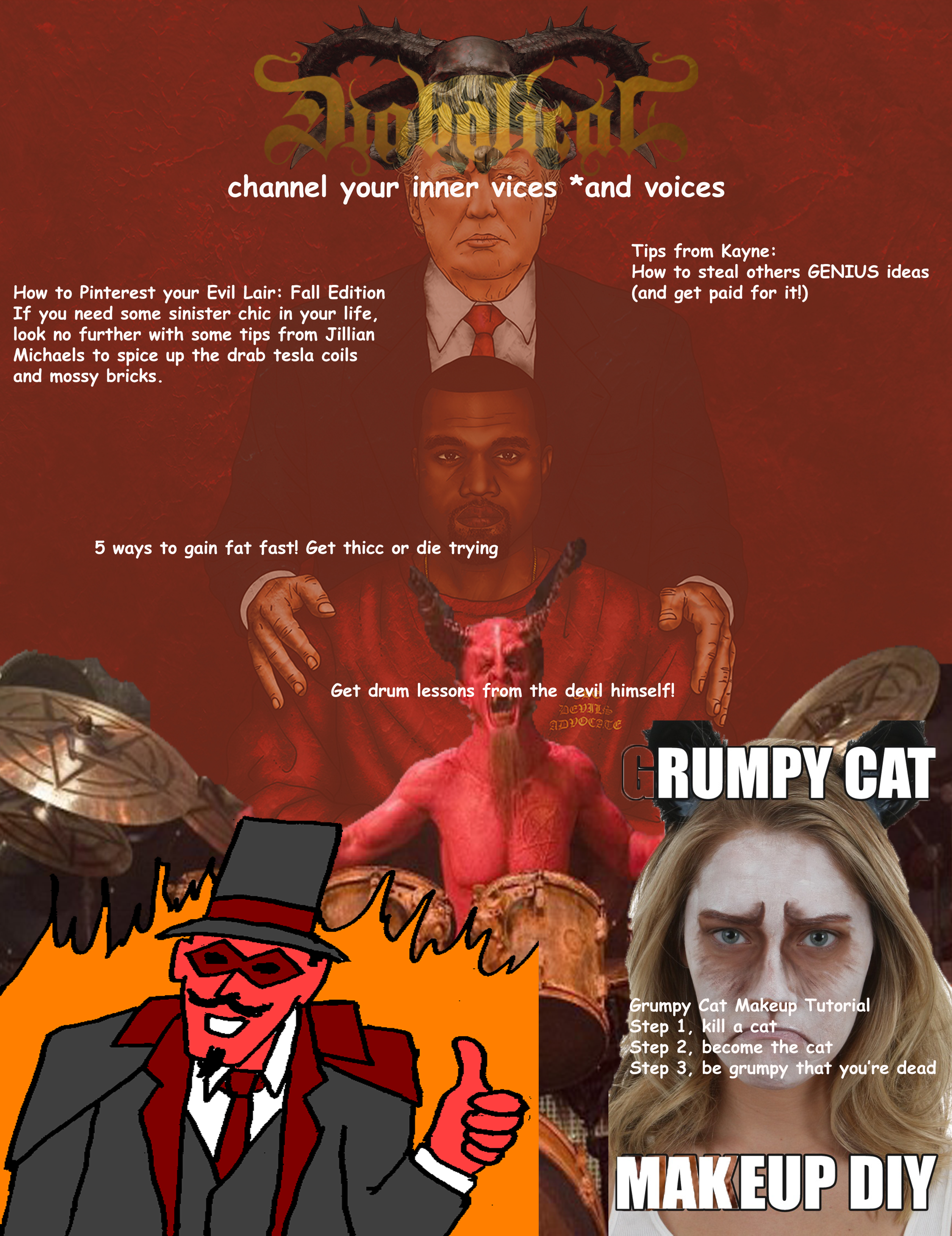
Diabolical: The Magazine

Muahahahahahahahaha

This week’s assignment for Design Foundations required us to use a color scheme and an adjective to create a cool and fantastical magazine cover. Out of the many eclectic adjectives we came up with, “diabolical” is the one we chose.

Diabolical: characteristic of the Devil, or so evil as to be suggestive of the Devil.

Though most of us don’t actually worship the devil (in public at least…I think?….It can be unclear sometimes), we decided to make our Diabolical magazine about all-too-real human vices; something you might say is, from the Devil himself. Everything from stealing to demon summoning is discussed.

Our color scheme from Adobe’s Color Tool gave us a variety of different options, but mostly had different hues and shades of red, orange, yellow, and dark blue. We decided to use the ones with most of the colors mentioned, since it gives enough of a contrast and pop by adding both yellow and dark blue.

As for our article titles, our sense of humor is…specific. Since most of us are exhausted, sleep deprived, and halfway insane, they weren’t too difficult to come up with. Who said vices and sins couldn’t be made to be funny?

Overall, we had a lot of fun and laughs with this project. Working together with this specific group of people is always a blast.
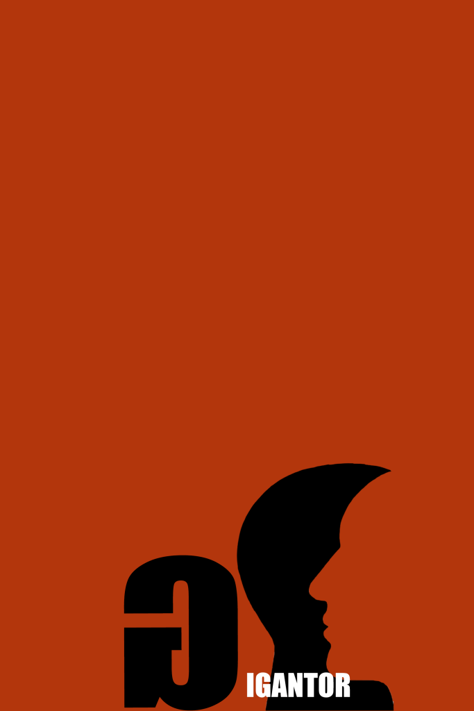
GIGANTOR

Gigantor’s the name……………………………………………………………………Love is the game

“From a young age, Gigantor has always been tall. That’s the reason for his nickname. As he grew and grew, so did his pride and ego. It seemed as if he could never stop growing! 8ft 3in and 26 years later, he seemed to hit an all time low. Every person he was dating complained about his selfish ways, which only made him grow taller. Full of sadness, he decides to go to a therapist. Next thing he knows, he’s in love with them. This person understands and feels true sympathy for him. They help him become more self-aware and selfless, not push him away in disgust. The more he falls in love, the more his selfishness goes away. With this, he starts to shrink. Foot by foot, he reaches an average height when he decides to settle down and live a peaceful life.”

Our design process, given the parameters of the assignment, was to basically make the most impact with as little space as possible. Since this is more of an introspective film, we decided to use artwork that seemed like a reversible figure. It works best for the purpose of this movie because it’s a transformation of one man into another. The red negative space shows his pride and ego along with anger that comes with those characteristics. It also shows the potential love that will fill him with joy. We made the artwork and letter G small to give a comedic/ironic effect, and to draw the viewer’s eye down to the bottom.

My Manifesto

Intentions for this blog are pretty simple: I want to showcase all my work, good and bad, for my own entertainment and self-motivating purposes. By the end of my TAM career, I would like to have this site as a means of self-reflection and appreciation for all of my hard work. In here, you’ll find many pictures and random commentary. With each assignment posted on here, I hope to clearly show snippets of my life as they happen. I believe consistency is key to a successful blog.

Design a site like this with WordPress.com
Get started