The Final (Project)

Part 4 Prompt:

Stage 4: Final Implementation and Documentation

Install at least one iteration of your project. Document how the users interact with it. Get some good photos, video, etc of your project in the space. Remember- for the final documentation, you will create a nicely-edited video documentation of your findings for critique. This (along with your design process documentation) will be how you are evaluated, so make sure that you walk us through your entire process!

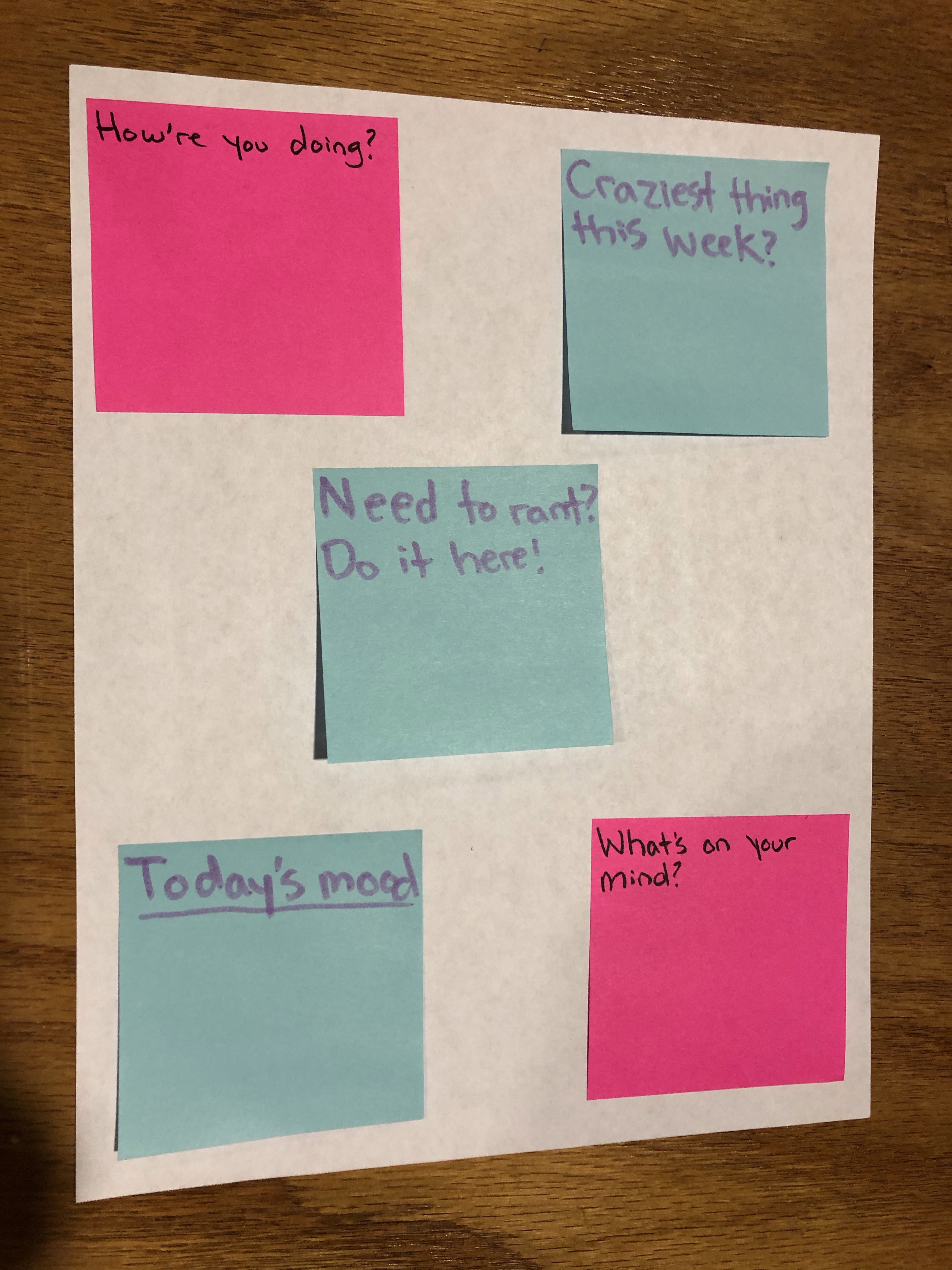
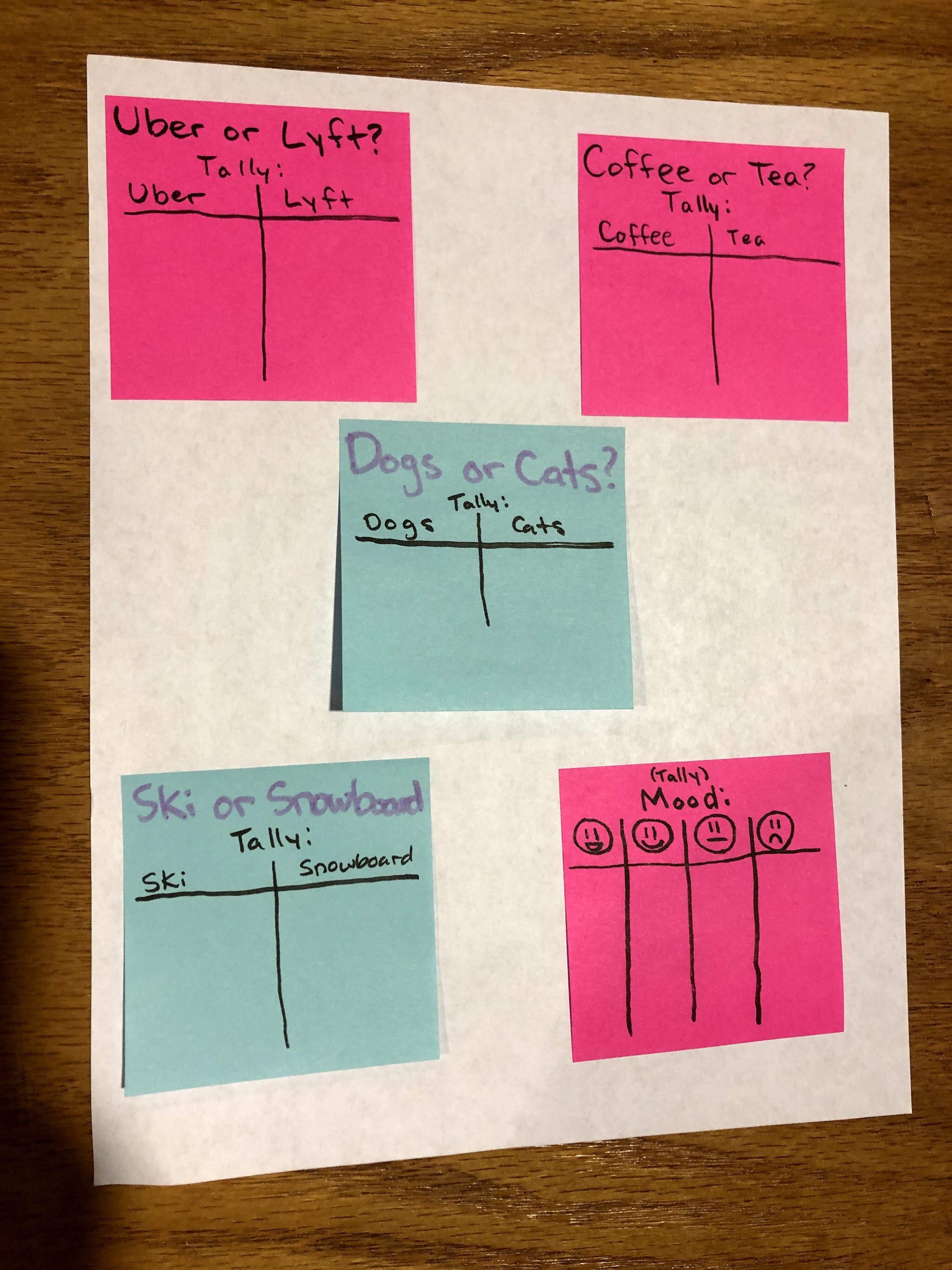
After all the prototyping we did, we ultimately decided the best place to document our final implementation was Starbucks. The first place we tried when prototyping was within the ATLAS Building by Pekoe. We shortly noticed many people had similar ideas to us and we weren’t the only ones to hoard the Pekoe area/lobby. This created too much competition, and honestly became overwhelming. We did have some success with the sticky notes, but we decided to use something more noticeable and sturdy: notebooks. Once we implemented the notebooks in a busy Starbucks, the results were slightly more receptive. Here is our final video showing this:

https://youtu.be/pEceydkvTi0

Statements from part 3:

What is less successful?

We learned that sticky notes are less successful because they will fall off the wall after a while. This also happens when they pile up because they get heavy, so notebooks are definitely going to be more effective.

What changes can you make in the future to be more effective?

Making each prompt visible at all times would make the project more effective. Also making sure the surface is smooth or the sticking method is more reliable would significantly improve our project.

What did you learn about the interaction between your ideas and the public?

Shorter phrases work better than whole sentences because people don’t look at the prompt for very long when passing by. Additionally, having many different colors can be more eye-catching. Additionally, people like tallying when there is a “__ or __” question. It seems that it would be good to have space for tallying along with space for drawing/writing below.

How did your thinking about the core problem change?

Starbucks has shifted to getting customers through lines as quickly as possible rather and ignoring the genuine connection and comfort than makes people enjoy coffee shops. To semi negate this we wanted to add an element of interaction to the space that not only encouraged fun and community but encouraged genuine conversations between people rather than manufactured customer connection quotas 
Tell Me a Story Part II

Prototyping:

This week we were asked to actually implement our storybook prototypes to test them out. Prompt:

Stage 3: Prototyping 

Create 5-9 prototypes of 1-2 of your installation ideas in a controlled space, and document the process. What about the idea is successful? What is less successful? What changes can you make in the future to be more effective? What did you learn about the interaction between your ideas and the public? How did your thinking about the core problem change?

Here is what we found out about our ideas:

– What is less successful? 

We learned that sticky notes are less successful because they will fall off the wall after a while. This also happens when they pile up because they get heavy, so notebooks are definitely going to be more effective. 

– What changes can you make in the future to be more effective?

Making each prompt visible at all times would make the project more effective. Also making sure the surface is smooth or the sticking method is more reliable would significantly improve our project.

– What did you learn about the interaction between your ideas and the public?

Shorter phrases work better than whole sentences because people don’t look at the prompt for very long when passing by. Additionally, having many different colors can be more eye-catching. Additionally, people like tallying when there is a “__ or __” question. It seems that it would be good to have space for tallying along with space for drawing/writing below.

– How did your thinking about the core problem change?

Starbucks has shifted to getting customers through lines as quickly as possible rather and ignoring the genuine connection and comfort than makes people enjoy coffee shops. To semi negate this we wanted to add an element of interaction to the space that not only encouraged fun and community but encouraged genuine conversations between people rather than manufactured customer connection quotas 
Tell Me a Story…

For our last Design Foundations project, we were asked to pick a design flaw, based on previous observations, and do something about it. What my group discussed over break was the bathroom situation at most local coffee shops: there’s never enough of them. Unfortunately, we can’t exactly solve that problem overnight. After all, some people literally live in them. We ultimately decided to make waiting to pee a little more fun/impactive. Here are our prototypes and sketches.

note-dec-4-2019.pdf

These are my sketches that I thought of over the past couple of weeks, and unfortunately, if you still see this paragraph by the deadline, that means I was never able to access to our group’s Google document (because I forgot to ask) and therefore cannot technically prove we (Patricia, Hannah, Olivia and me) worked together. Just trust me I guess? We all are equally excited and looking forward to its final implementation.

https://docs.google.com/document/d/1HD8-9XBKUFoFn03YneR5oT-FCpRE4izP1y8UPzA76zA

It’s All Fun and Games

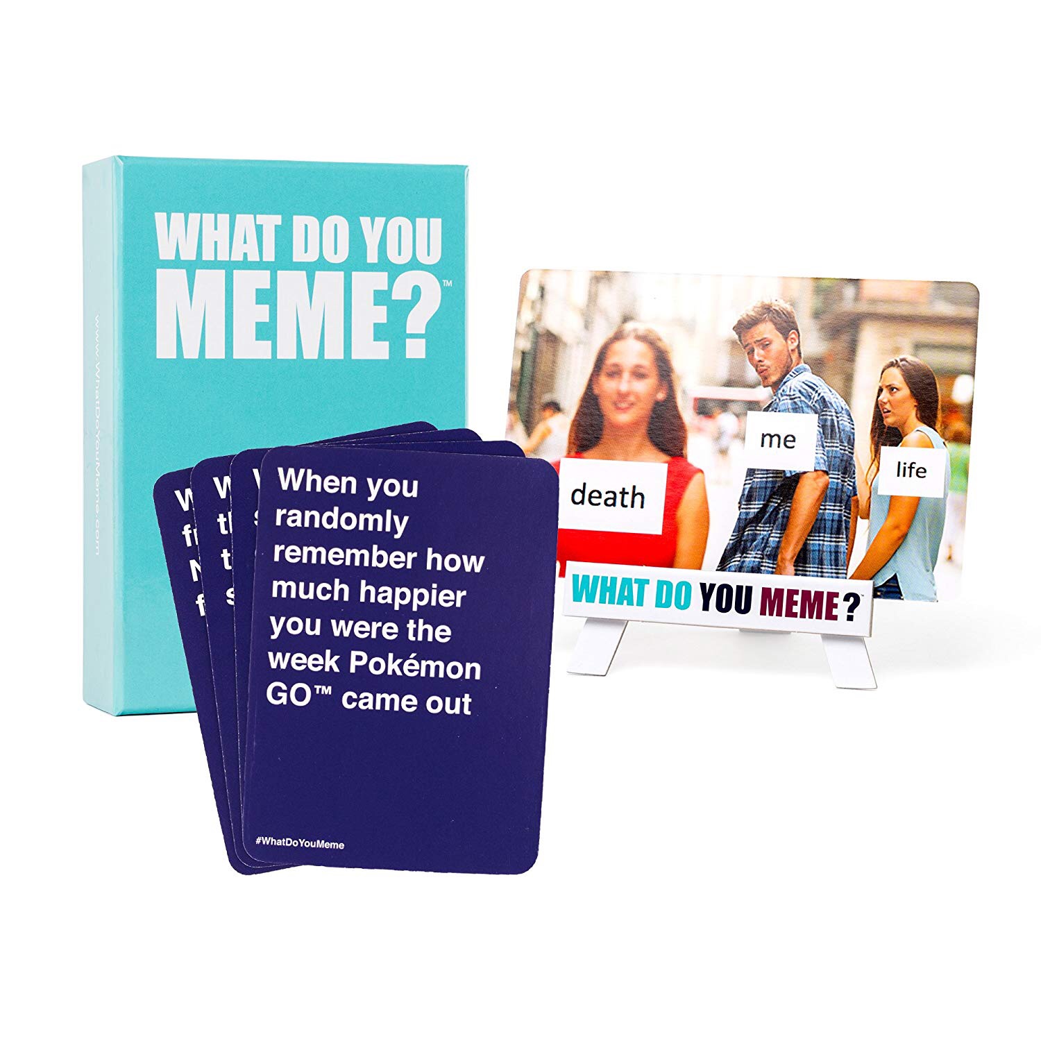
In this week’s assignment, we were asked to observe people playing a game while not being involved. The game I chose to observe was What Do You Meme since I’ve played it before and some of my friends hadn’t. I let them have free range and didn’t tell them about any rules. However, whenever we play any game, whether it be a super serious game or not, we have a hard time following every rule included in the manual.

Rules of the game are similar to Cards Against Humanity but instead of there being phrases to finish sentences, there are certain phrases to react to classic memes. If someone has played Cards before, then they’ll understand the gist of the game. If not, we always pull out the instruction manual. The rules are always changed however, because everyone wants to benefit themselves. Sometimes there are certain memes that fit better, so people switch out their picks all the time even though that’s not what the rules say. 

With this game it’s more about the laughs and experiences, not necessarily winning a prize or the game as a whole, though it would be nice to. Having fun and laughing until you want to pee yourself is why we played it, because there’s nothing better than taking a few hours out of your day to relax and de-stress from midterms or other obligations. In my case, active play was very secretive and everyone trying to hide their cards from someone else. The choosing process of the perfect meme caption was a very serious task until everyone else put their cards in. Passive play was more like the person browsing their phone or being super impatient to others choosing their card. Another thing is that this game can last forever if it wanted to. 

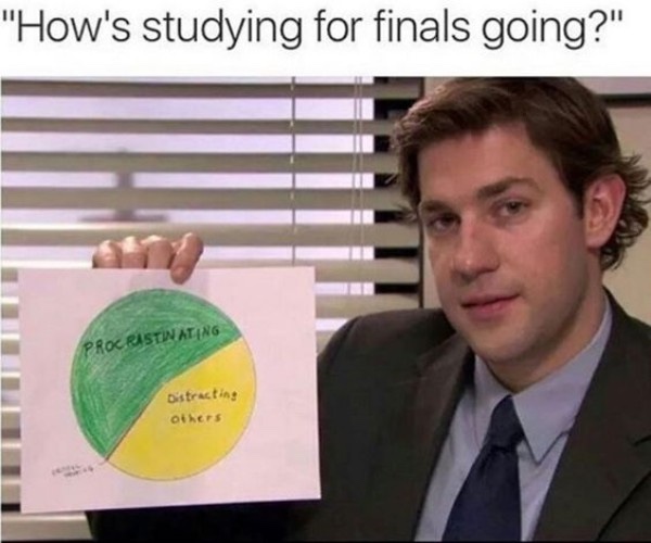
After a while everyone got tired of the memes and how some of the bottom-of-the-pile captions just weren’t that funny anymore or not relatable.

The Only Gloves You’ll Ever Need

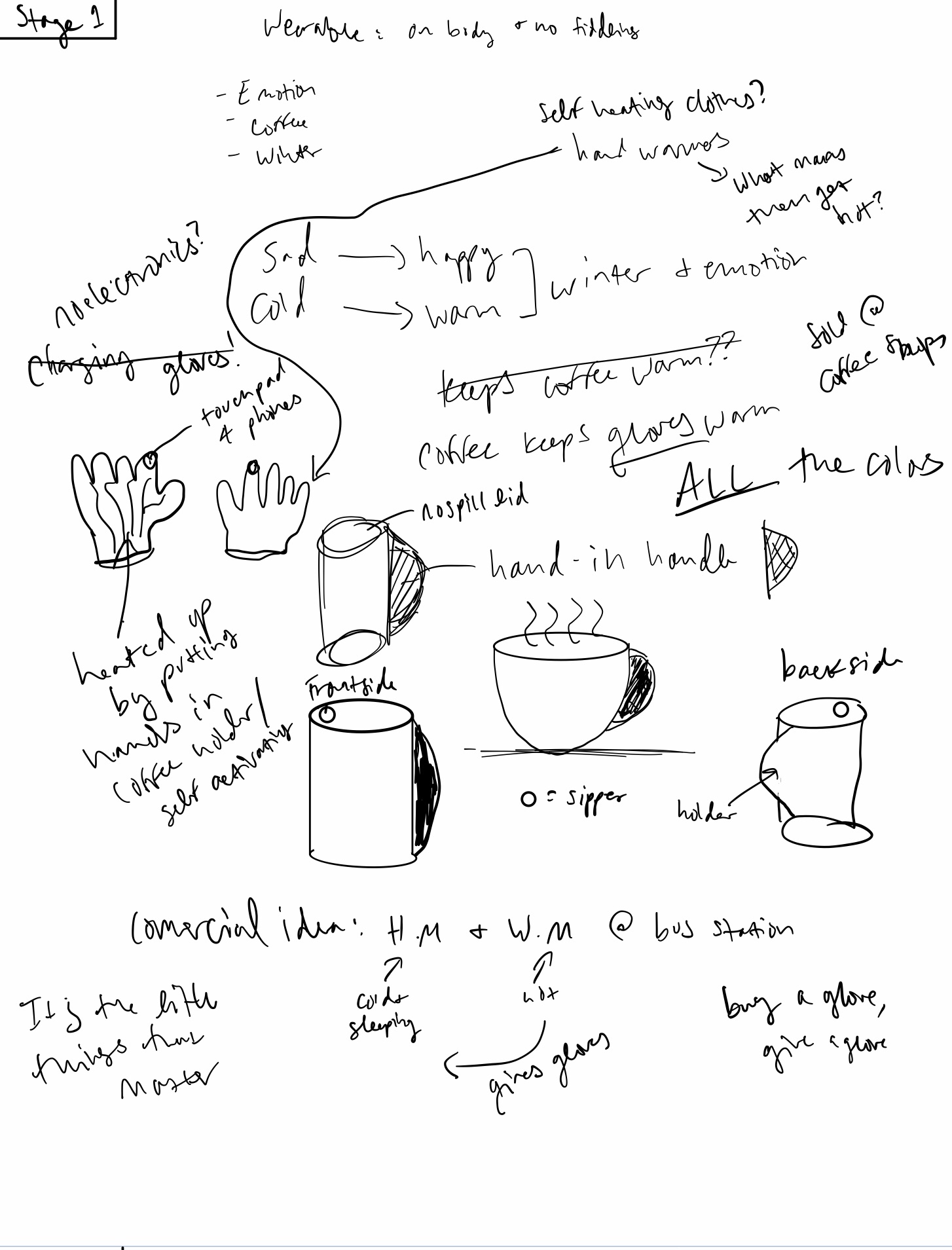
In today’s recitation, we practiced the process of Prototyping using the basic concepts of Look/Feel and Role. Below you will find those processes and the feedback I received for each stage.

Stage 1:

Words
• Emotion
• Coffee
• Winter

(AKA, my 3 favorite things)

I saw this video on Youtube one time that showed a ceramicist (person who makes ceramics??) make a mug that had a “hand-in” type of handle. By this, I mean your hand kind of goes INTO the cup through a slit on its side. The second I saw the word coffee, this was the first thing that came to mind.

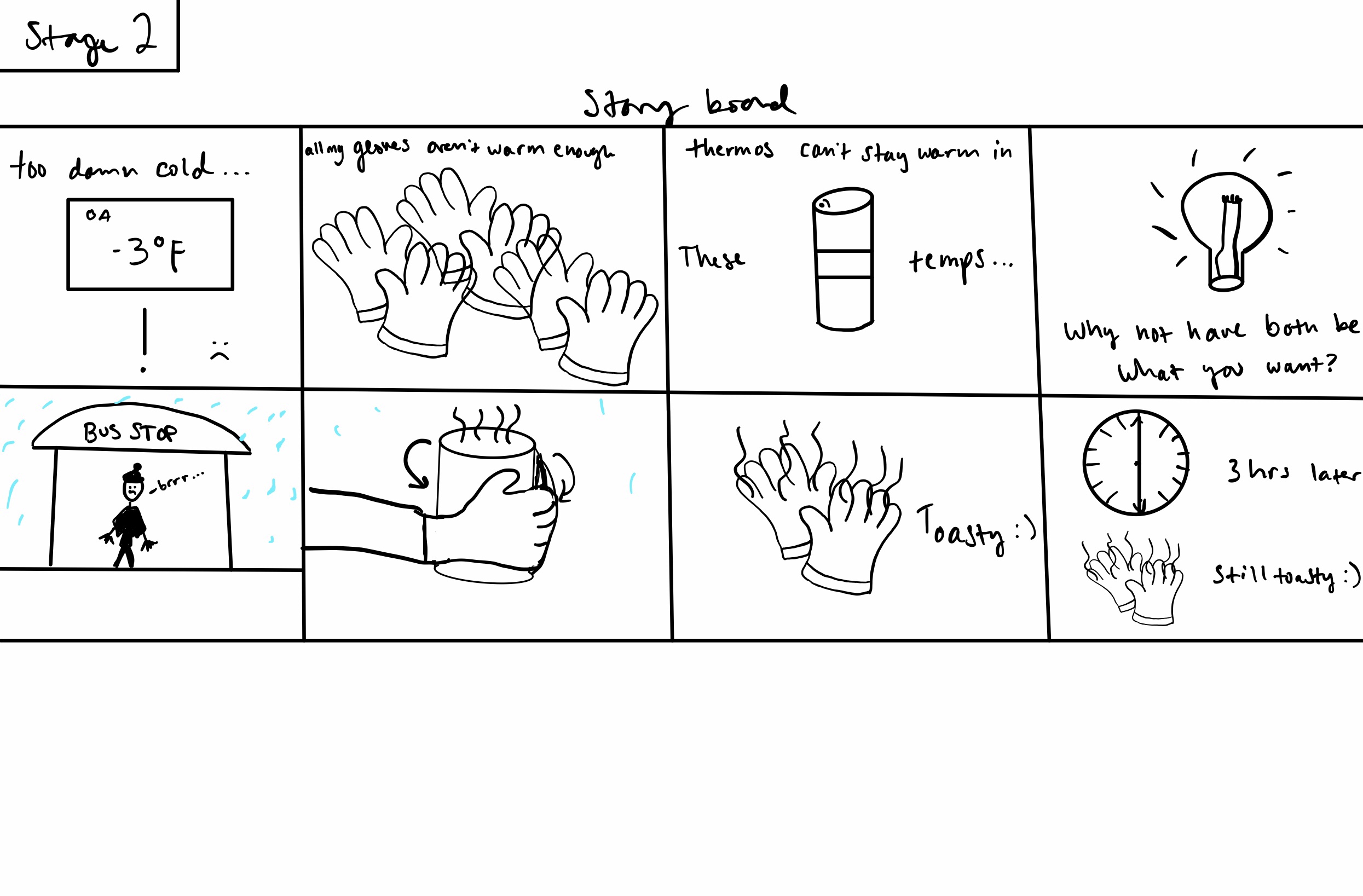
Stage 2:

Feedback:
• safety: concerns about burning skin on hands
• Role of the mug is slightly confusing
• Gloves make sense, focus on mug/tumbler

I was sort of expecting this kind of feedback because I myself was wondering the same thing when I was drawing up my idea. As for the storyboard, I focused more on the use of the gloves because I felt that would have been the most helpful to see/know. The tumbler is more of an accessory to the gloves themselves.

My plan was to have the gloves be self heating and cooling in a way. Hand warmers are a necessity in the winter, especially when doing any kind work outside. This technology would be incorporated into the threads of the gloves and activated once the outside temperature got below 45-40 degrees fahrenheit.

Stage 3:

Feedback:
• materials are specific, and ones provided wouldn’t work
• Good idea for the homeless
• Think up of some handwarmer-type fabric to weave into gloves so that it self heats and cools down after x amount of hours

I mean this with respect, but the materials provided did not give way to any decent physical prototype I was going for! That’s okay. It’s the idea that counts. Based on the feedback I received, I wanted to go ahead with one of the suggestions of giving some to the homeless or those who don’t have warm enough clothing in the winter. I would love to do what TOMS does, and give a pair away for every pair bought.

Overall, this project was fun. I feel I definitely have a better grasp on prototyping and why it’s so important.

Problems, Problems, Problems…

In today’s assignment, we were asked to observe a space for an hour, and take note of things that were or were not working for that space, and how there could be ways to improve it.

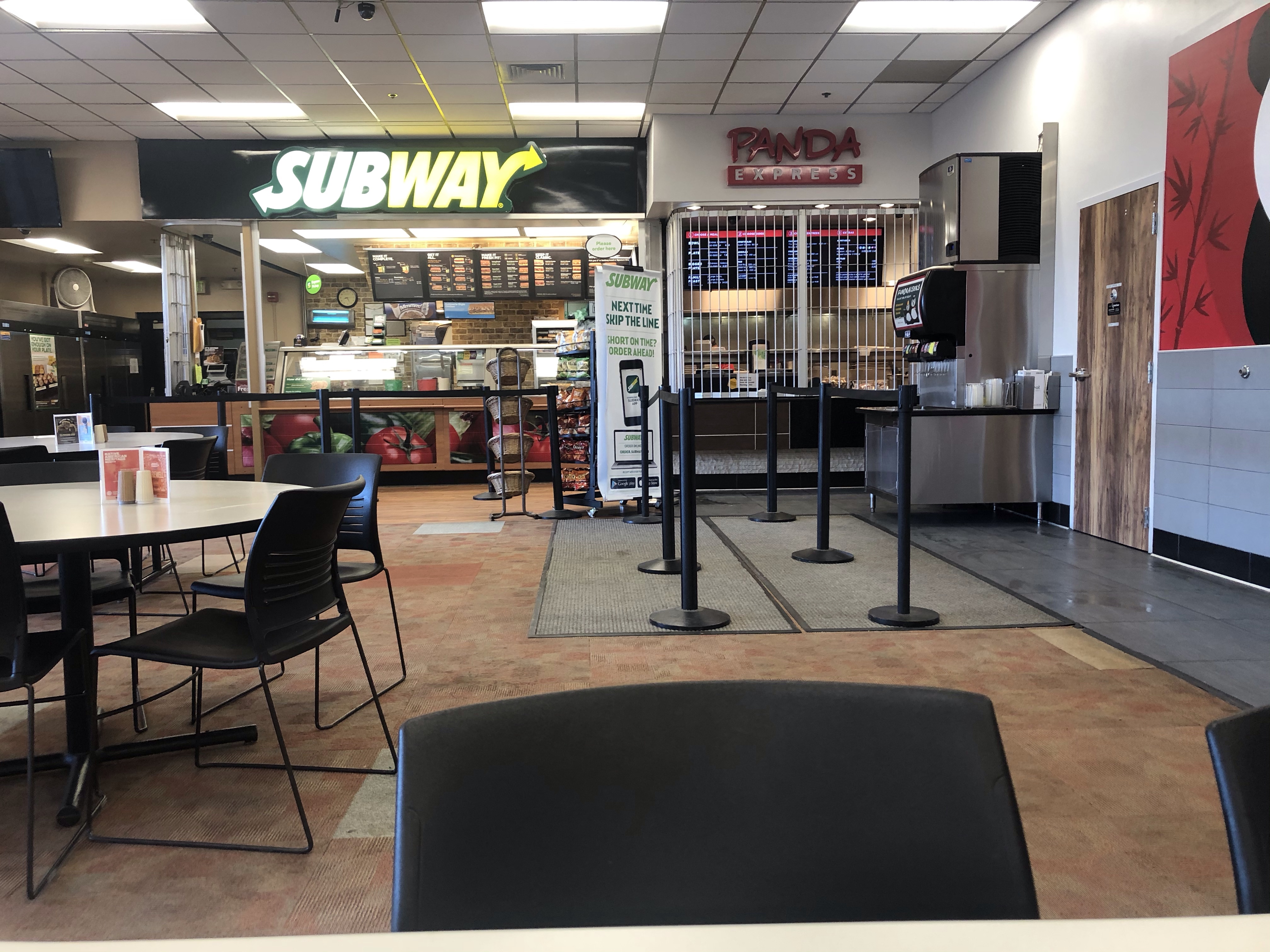
The space I chose is the UMC where the Panda Express and Subway are. Currently, they are right up against each other with a flimsy barrier between each designated order line. On more than one occasion, this particular space has sprung some strong emotions within me. The fact that the space itself is so small, the lines get too crowded, and the noise becomes unbearable is what prompted me to sit here miserably in the first place. I know for a FACT that this area is a cause of concern and source of frustration of many, including myself.

First of all, when people start lining up, they have to shout their orders over each other to be heard by the food preparers. This is triggered by the fact that the ordering stations for both Panda and Subway are right next to each other. Did the person order chicken or beef? Who even knows. This leads to confusion on both ends of the service. Next, let’s talk about after the order has been taken. Since it does get loud in this small space, people tend to put their headphones back on to block the noise out. At Panda specifically, order numbers are yelled out into the void and maybe you’ll get your correct order.

To combat this confusion, I would put a little extra screen that showed the order that was completed, like McDonald’s does. As for the space issue, I feel the big doors right next to Subway could instead be incorporated into each respective restaurant so that the smelly trash won’t be taken out in front of the customers (they have to go all the way outside their space to throw things away and walk through the ordering space). By moving Subway over and creating a storage space in the middle of the two places would solve the issue of ordering confusion. I also think a thin, half wall behind the ordering area would be helpful with noise reduction and the crowdedness.

I don’t personally think that these areas could effectively incorporate some kind of play, but anything that brings a little more fun couldn’t hurt anyone. Something that could be incorporated is an electronic game board. I’ve never waited more than 10 minutes really to get food but anything to keep the queue distracted and less stressed is always a plus.

Denver Interstellar Airport

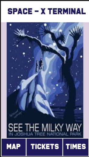
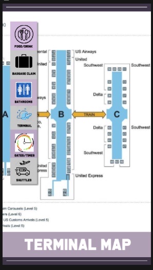
This week’s challenge was fun. We had to design a kiosk for a new Space-X terminal at our airport. Here is our thinking process:

Appearance: There’s this artist who does prints for the National Parks, and I love the way they combine vintage poster aesthetic with current/updated topics and minimalist design. Most of the interface will consist of muted “galactic” colors like purple, blue, black, and white since travel itself is stressful, this will help reduce tension for the user. Color coded signs will indicate differences between various information topics, and if the security line is long, will be shown as a bright red. 

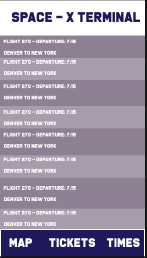
Space & Time: For the space and time aspects of our designs, we plan on putting the kiosks all over the airport to incorporate ease of access to all travelers. We are hoping to put them immediately outside the tram stops at each terminal. As well as within each of the hallways next to the gates so that people can look at their information before they board. For the time element of the project, the kiosk will constantly be updated in time so that it will always have fresh information of arrivals and departures. That way, there is no old information being displayed.

Sound: Each icon will have its own unique sound in order to differentiate the images. Baggage claim will have a soft, two-second chime to alert people that baggage is on the way. For every time that the security line goes up, it will have a low, one-second bong sound, while every time the line goes down, it has a higher-pitched, but still soft, ding sound. By using sounds, the airport will help its visitors to associate each sound with a meaning so that they can stay alerted to information without even having to look at anything. 

Motion: New gates and times that appear on the flight information board will swipe in from the right to create a smooth and not jarring transition. Changes in security wait times on a screen will be a quick appearance that does not waste time in getting information to the viewer. 

Texture: The kiosk will be matte and smooth. Very high-quality feelings to the screen. The screen will vibrate depending on certain actions. The kiosk itself will be white, clean, and minimal. All the color will be on the actual screen. 

Wholefüds at CÜ

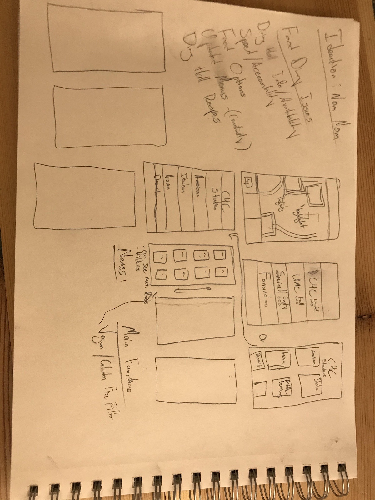
Today we started brainstorming for a food application. Here was the ideation process for all members of the team:

Dining Hall Menu & Info: 

Stephanie:

  • Rating system: students can rate each restaurant / specific food
  • Voice activated notifications linked to headphones.
  • People can upload photos of food 
  • Night mode for app 
  • Filters to filter out dietary restrictions… ex . vegan, gluten free. 

Spencer:

App UI/UX mockups

Josh:

  • Google maps like implementation to analyze 
  • Bouncing 90’s screen always hits the corner
  • Aesthetically pleasing stock footage to watch during meal
  • Hack into campus cable and steal feed. 
  • Dining hall recipes
  • Audio integration 
  • Aesthetics like vaporwave 

Bianca: wholefüds at CU

  • food recommendation:
    • What tastes good
    • Popular purchases
    • Food combinations
    • Can be just dining halls or outside like on the hill 
  • Busyness and food options of the day
    • UMC between 11am – 3 pm is so busy
    • Double check if your favorite meal is available since the menu changes everyday 
  • Application: watch, in-ear, and phone, maybe tablet
  • Better pictures!!! Most campus photos are ugly sorry!!!
  • Nutritionist feedback and help
    • Healthy tip of the day
    • Healthy meals of the day
    • Meals for those with dietary restrictions 

Highlighted aspects within the PDF show our final idea picks.

It’s a Revolution

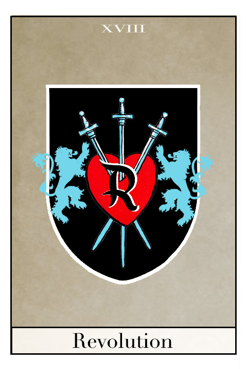
Me and Peyton Ruhmkorff teamed up for this lettering/logo project and the results were fantastic I think. Both of our last names start with R; what other words start with R?

Royal

Rage

Revolution

Renaissance

Radical

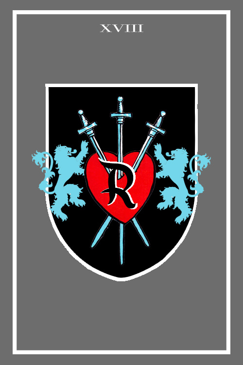
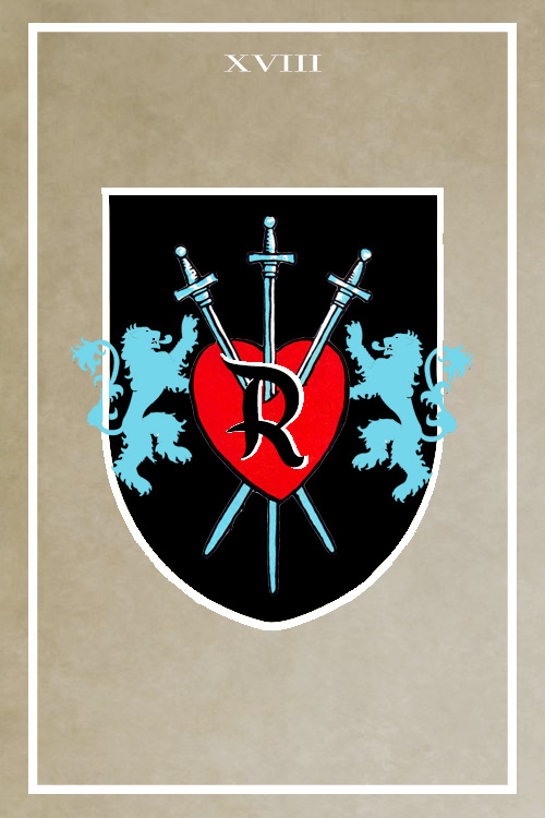
Do these words sound familiar? Think: medieval movies, conquest, magic, and power. What we decided to do was turn our letter into an emblem then into a tarot card, and I can confidently say we were both happy with the final result. We tried not to spare any details.

Her love of tarot and my “royal” sounding last name (and my interest in the occult) transformed the letter R into a new tarot card. We used photoshop and Google images to create this piece. Shown above are the various methods we used to transform it into it’s final state.

Olivia’s Logo

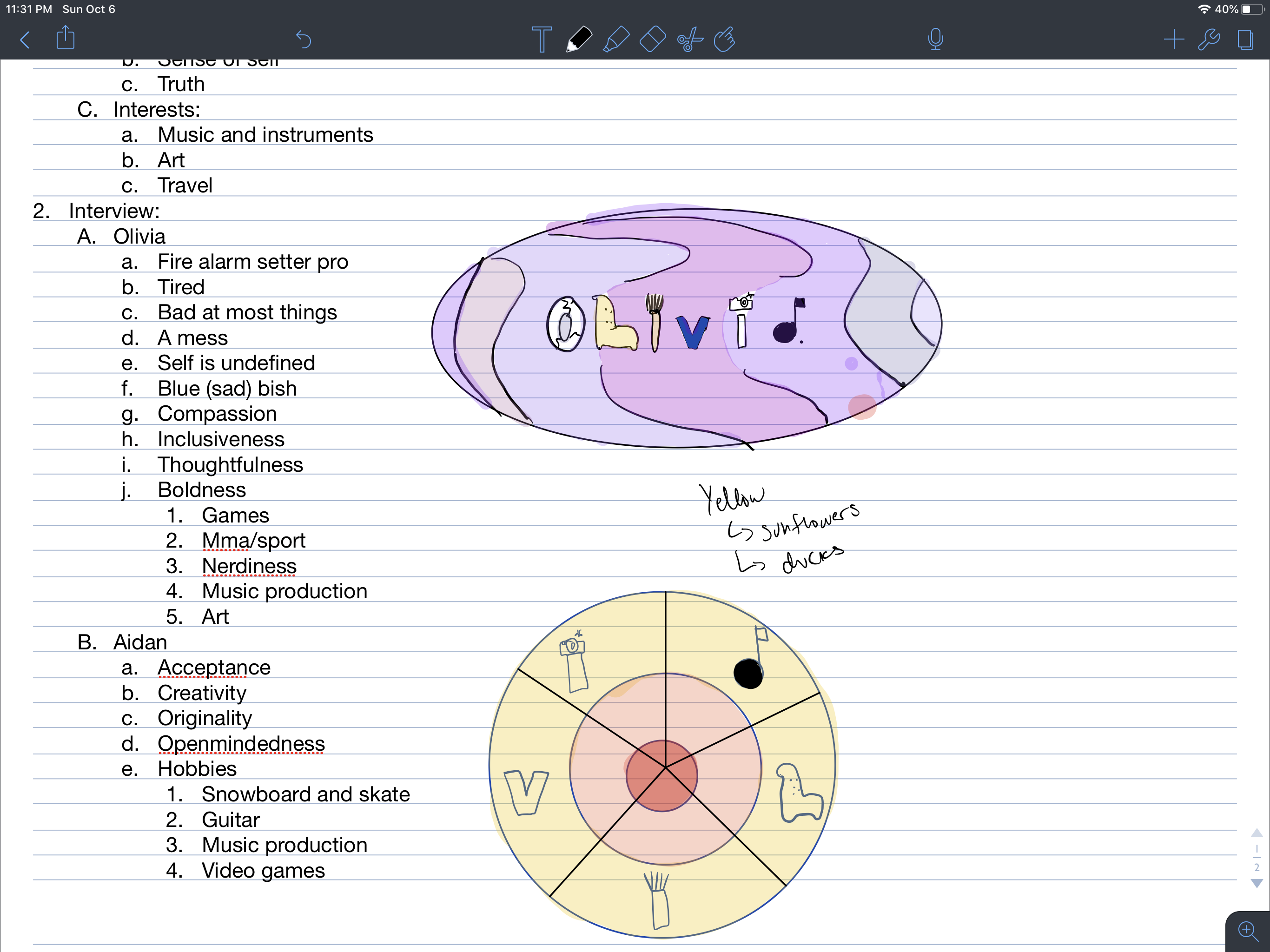
If I’m being completely honest, I don’t think logos are my thing. However, I do believe in practice makes perfect, and boy did I practice for this one. I chose to design a logo for my friend Olivia. After a million tangents within the interview itself and both of us being completely sleep deprived, this is the best I could come up with!

Enjoy?

The final logo is the yellow one at the bottom. It basically spells out her name with the things she likes the most

logo-a-gogo-1.pdf

Here is the link to the original document

Design a site like this with WordPress.com
Get started